Tuesday, July 31, 2012

How often should you update your website?

This subject has come to our attention a few times of late. Most recently when Audrey realised the Spiral website was in need of a bit of an overhaul. I guess we just get so busy working for you that we forget to work for us sometimes. So how often should you change your website? How do you know when the best time to make the changes is?

To start with a quick look will usually show you that some things that need changing are fairly obvious. A website full of out of date information is no use. A site that still has a banner on the homepage about a long past event just looks bad. But what about the less obvious stuff. Is it just the content that needs to be updated or are layout and design changes necessary as well? I had a bit if a look around the web to see what the general opinions were and if they matched up with what we think here at Spiral.

A lot of what I ended up reading recommended change but the exact times to do so varied massively, from every few months to daily! If any of you do a similar search I'm sure you'll find the same wealth of unhelpful information. I decided to take more of an in house approach and see what Audrey thought about the subject.

Basically it boiled down to keeping the information current. The design work that you have originally should last if it has been done well but as your business changes so should the information on your website. We know how hard it can be to keep on top of something like website content when running a busy company. It has a low priority when you're looking after your customers first, which is of course exactly what happened to us here at Spiral. Audrey came up with a list of times that are great for updating your website based on what is happening to you and your business rather than based on the arbitrary passage of time. Her key suggestion was that you establish a pattern or a plan and follow one of the following strategies:
  • Try updating anytime you have staff leaving or new staff arriving. Changing the 'About Us' and 'Contact' pages can be a catalyst for having a quick check of the rest of the website.
  • Update your site every time you finish a big project. This is a particularly good option as it gives you the chance to add some information about the project to the website to highlight what it is that you have been doing. You'll also hopefully have a bit of extra time just after completing a large project.
  • Anytime you have any new print collateral produced for the business it is a great opportunity to update your site and to make sure it fits well with any changes to the look and feel of your business.
  • If you've won any awards or recently been featured in any publications then you should certainly be looking to update your site. Here is a chance to show off your achievements while at the same time you want anyone brought to your site by the extra publicity to be receiving the most up to date information about you.
So with a plan in place you can ensure that your website is kept up to date. Not everyone has the time or the inclination to check their website regularly to make sure they're up to date and arbitrary time periods can make it a chore. Planning to update around events breaks up the regularity, provides a reminder and can provide extra motivation. This is particularly true if the event would have required a change to part of the site anyway. Your website should be updated when it need it. By establishing strategies like these you'll know when that is.

The scrolling news box and how to use it.

 Have a look at this nifty little addition we can add to WebShell sites now. Just another example of our ongoing innovating.

As a start we'll have a look at what the scrolling news box is. It is simply a small box that can sit on the side of your page that contains a scrolling list of text that slowly moves downward and will freeze if the mouse pointer is hovering over it. 

 
The box from rethinking.org.nz

To edit the content of the box you simply login to the website editor in the usual manner. The Box will then have an 'edit' button at the top that you can click on to add or change the content of the box.

How the box appears when logged in

This is how the editor looks. It is the same as the basic WebShell editor for any of the other pages. Simply add or alter the content however you want then hit 'save' to update the box.

The editor

This is a handy new feature that is incredibly easy to manage and can add that little extra something to your site.

Why I like Picmonkey.

Here is a nice free option for editing images that we've had a quick try of recently. It's useful both for your personal photos and for any images that you might be uploading to your website. The basic image editing software that everybody has can be pretty limited but buying software can cost hundreds of dollars. Picmonkey can be used from any computer as it operates online and most importantly it is both free and relatively easy to use.


Similar in concept to the now closed Picnik.com Picmonkey gives you a variety of editing options. It also gives you a chance to have a bit of a play around with a photo of a cat if you're interested in having a look at what can be done before editing any of your own images.


I like this website because I see it as another part of the move to online operation and the provision of more and more free services in the cloud. A democratisation of the web. Anyone with an internet connection can access these services and access the tools that were once so expensive they were only practical for professional image editing. Obviously not everyone will want to use Picmonkey but I think the fact that the option is there is amazing. It's one more step towards the integrated online future that I and the rest of us here at Spiral are excited to be a part of.

Thursday, July 12, 2012

Pinterest from a beginners point of view.

Spiral is new to Pinterest. I signed us up this week in the hopes of discovering a little more about it and with the hope that it could be useful. Both to our clients and to us here at Spiral.

At first glance it looks like a bit of fun. There are thousands of cool pictures already pinned up there to browse and anything that catches your eye you can repin to your own boards. Any pictures you see on another website you can also grab and pin to your boards with the click of a button (your boards are just the way you organise images by category on your page). It's like having an online scrapbook. The key feature I can see is the ease with which you can pin images from anywhere at anytime. From amazing landscapes to stunning culinary creations, there are great pictures of everything out there.

Spiral's Pinterest page so far. Check it out!
But why should a business have a Pinterest page? Well we originally wanted to be on Pinterest because we are a little bit nuts about the web. We want to try everything that might be useful to us and our customers. However it quickly became apparent to me the constructive ways we could use Pinterest. We could post a portfolio of websites or software that we've created so that others can see what we do. We can post pictures of things that we like so that others can see who we are. We could even post pictures of products that we sell. One of the great features of Pinterest is that the pictures contain a link back to the original source no matter how many times they have been repinned. I can see this being particularly useful for any business with an online store as images pinned to Pinterest will contain a link back to the original product page and (if it's a popular picture) the image could be repinned over and over again around the world.

Is it worth it? From a personal perspective I would say this is a great way to have a look at some of the amazing pictures out there and a great way to create your own online scrapbook. From a business perspective it could be a great way to get some exposure. A great way to display who and what you are on the web, particularly if your products are visually appealing. It doesn't replace other social media options but it does complement them well. Images have been shown to be one of the most evocative and powerful resources in the online world. Maybe now is the time to get a few more pictures out there of who you are and what you do.

Like us on Facebook or Follow us on Twitter to hear more in the future!

Tuesday, July 03, 2012

HEAT Trial: Our software in use across Australasia.

After months of development, we're preparing for the roll out of our innovative software system in one of the most ambitious clinical trials to be undertaken in Australasia.

Involving over 700 patients across 22 Intensive Care Units in Australia and New Zealand, the HEAT Trial focuses on the effect of paracetamol on critically ill patients with known or suspected infection.

Co-ordinated by the Medical Research Institute of New Zealand, in collaboration with the Australian and New Zealand Clinical Trials Group, the trial begins on 15 June, and as Chief Investigator and Intensive Care Specialist, Dr Paul Young points out, relies heavily on having effective IT systems. “At each of the 22 ICUs involved in the study there will be at least 100 staff involved, which means a total of over 2000 staff contributing, so our IT systems need to be very intuitive and Spiral has delivered just that.”

Pilot testing of the software is currently underway at Wellington Hospital, and Spiral Managing Director, Audrey Shearer is pleased with the initial results. “In a trial of this nature the integrity of the data is a key factor, so we’ve had to build lots of checks and balances into the software and provide a clear audit trail. At the same time however we wanted it to be easy for medical staff to use, with minimal training required. And from the feedback we’ve had, it looks like we’ve achieved that. Staff are able to input data directly into the software, which is a huge time saver and reduces the chance of error. Using cloud based software, with all information stored on the same server, it’s also possible to get accurate information in real time, a huge advantage when you’re dealing with critically ill patients.”

In selecting a software supplier for the trial, being Wellington based was important to the MRINZ. “We found the regular face to face meetings and the fact that they operate in the same time zone really valuable,” says Dr Young. “Spiral’s cloud based solution has also come in at a fraction of the cost of previous systems and is likely to set a new benchmark for multi centre research.”

The HEAT Trial follows closely on the heels of another cloud based software solution developed for Hutt Valley company Medent Medical, who came to Audrey with an idea for integrating their customers’ ordering process with their website. Now Medent is rolling out its innovative system to medical centres throughout the country, transforming the way their customers order medical supplies.

Audrey maintains there’s a growing market for taking local software solutions and publishing all or part of them on the web, particularly where you have multiple users, multiple locations and a need for real time information. “For a self confessed ‘software developer who loves the web’, it’s an exciting time.”

Thursday, June 28, 2012

Why I like Facebook email.

So my last post was also about Facebook's email features and it wasn't particularly positive. That had a lot more to do with the way they had been thrust on us rather than the fundamental features though. Facebook email is actually kind of neat. It has the potential to be the start of integration of the two things I check the most online. Ever since Facebook rolled out the @facebook.com email addresses for every Facebook user the potential has been there to have emails sent directly to your Facebook messages or to send messages to any email address from Facebook. Here is an example below where I was testing the service sending a message from my Facebook account to a gmail address.
Sending the message from my Facebook account.

What the message looked at in my gmail inbox.

While not everyone has or uses Facebook regularly the ability to manage your emails and social networking in one place could become very useful. The service handles attachments well and can easily be used for quick messages while on Facebook. However, until it can integrate with current email addresses I can't see it being particularly popular. It is fairly basic at this point and there are not a lot of options for organising messages easily. Particularly for personal emails though I would say there is some serious potential here. Like us on Facebook or follow us on twitter to hear more tips and tricks in the future!

Wednesday, June 27, 2012

Facebook changes email addresses.

Yesterday I noticed a small change to my Facebook profile page. Where I once had my personal email address displayed in my contact info under the 'about' button I now had an @facebook.com address. I see this an attempt on the part of Facebook to have a larger presence in another area of our internet lives. This desire to take a larger chunk of the pie is not necessarily either a good or bad thing but I am not a fan of how they have gone about making this change with no warning or notification. I had specific reasons for having my personal email address available in my contact details for my friends to see and you might have as well.

Luckily changing it back is fairly simple and can be done in a few easy steps:
  • Navigate to your profile page and click on the "About" button just below your profile picture in Timeline.
  • Scroll down to the "Contact Info" section and hit "Edit". You should get a drop down like the one below.
  •  On the far right of the image click on the drop down menu next to the circles. You want to switch the setting for your personal and your @facebook.com email addresses so that your personal one has "display on timeline" selected and the @facebook.com address has "hidden from timeline" selected.
This should change things back so that once again an email address that you actually use is displayed. Check us out on Facebook for more posts like this or follow us on Twitter for helpful and interesting titbits. Coming up... Why I like Facebook email addresses.

Wednesday, June 13, 2012

Password Security: How good is yours?

How bad would the damage be if your passwords were stolen?

Last week's online attack that led to the theft of several million passwords for professional networking site LinkedIn and for online dating site eHarmony highlighted the vulnerability inherent in having an online presence. Perhaps the theft of your password for one website doesn't seem like it could do much damage but consider how many of your passwords are the same over multiple websites. How many sites or profiles could a hacker gain access to if they had your email password, especially with all of those helpful "I've forgotten my password" buttons on so many sites? How much information do you have stored online; either in email accounts, documents or online photo albums? In this story on Stuff a Christchurch nurse lost all the information she'd saved over the years in her email account which she'd used as a "filing cabinet".

Is there no hope for password security?

This isn't to say that there is nothing you can do. We are not all just playing a giant game of chance with our online information. There are some simple steps you can take to minimise the risks. Obviously the best step would be to have totally different passwords for every site you use, especially when you combine numbers with both upper and lower case letters. Passwords that are completely unrelated to anything and that look like you generated them by dropping a cat onto a keyboard are very secure. "y7Gs55sUt" or "jc8B5p7Qq" would both be very difficult to crack. While those would be great I know that I would have absolutely no chance remembering one of those passwords, let alone the dozens many of us would need to use over different websites.

One option is to use software to store and even generate passwords. 1Password and LastPass are a couple of examples of programs which can be used to shift the responsibility for remembering passwords away from your memory, which opens up a huge variety of ludicrously complex password options. Suddenly "jd6FF8sJ8v" becomes just as practical as "cat" as far as your memory is concerned. Of course you then need to make sure you have a very secure password to log in to the service in the first place but one complex password is much easier to remember than twenty would be.

A few tips for creating stronger passwords

  • Avoid using words from the dictionary.
  • Include a mix of upper and lower case letters as well as numbers.
  • Don't use "password" as a password. You'd be surprised how many people do this.
  • Try using the last or first letters of a memorable sentence for a secure password. e.g. "When I was 13 I lived at 3 Makaro Street" = "WIw13Ila3MS"
  • If you have to use the same password for multiple sites think about what would happen if a hacker stole that password from one site and tried it on them all. Try at the very least to have different passwords for your email, your online banking and for the rest of your internet presence.

Final thoughts on password security

It is incredibly important to be thinking about password protection when online. The web is an open environment with tremendous opportunities for making connections and for organising data but its same openness creates opportunities for hackers. There is always inherent risk in the world around us, we just need to be sure that me do our best to minimise those risks. Follow us on Twitter or 'like' our page on Facebook for more tips in the future.


Monday, May 07, 2012

Human readable URLs, and Routing in WebShell

It’s been on the to-do list of WebShell improvements for a long time. Turning the URLs (addresses) in our content management system (CMS) into something a bit better for humans.

I will use a client site for an example, the address of the “about us” page for Boyd HQ used to be “http://www.boydhq.co.nz/default.aspx?Page=4099” but with the upgrade it becomes “http://www.boydhq.co.nz/c/About-Us” (note: the old address still works to so any bookmarks search results and links are still good).

Why did we do this?
Two reasons
1) It just looks nicer
2) The addresses are much more memorable and easier to direct people to

Why now?
While there have been ways to do this in the past, with things like URL rewriting or generating a file for each page, they were mucky and not that robust. The routing technology introduced in previous versions and improved in version 4 of the .net framework has changed things.

How it works for anyone interested
Neither “http://www.boydhq.co.nz/c/About-Us” or “http://www.boydhq.co.nz/c” actually exist as real files or directories, "/c" (c for content) exists only virtually as a rout to "/default.aspx" (the same page used in the old system) the rout passes with it the page variable, (in this case "About-Us")  WebShell uses this variable (just like it can use "Page=4099") to pull the correct content from its SQL server database and display it within the page template. Routing can be used for much more complex URLs with many more variables and we look forward to using it more in the future to produce better and more human friendly URLs in other projects.
And in case you were wondering where the page address "About-Us" comes from WebShell first tries to use the navigation title of a page (in this case About Us), then the long title then several combinations of the 2 titles with parent pages until it finds an address that is unique within the website so even if you give 5 pages the same name in the navigation they will be given different addresses by WebShell. In most cases there will only be one and your page is just named the same as it is in the navigation with spaces replaced with a dash.

Wednesday, April 11, 2012

Log in to make changes to your website

Making changes to your website starts with logging in to your dashboard. You do this by going to www.spiral.co.nz, on the right hand side you will see a box for client login. Enter your username & password here and click on the "Sign In" button.

If you enter the wrong password for your email address you will get the alternative login screen so you can have another go at logging in.
If you don't remember your password, you can click on the "Forgot your password" link to have WebShell send you an email that enables you to reset your password.
or call us in the office on 04-5862686


Thursday, March 29, 2012

Twiggy's Broadband Mistake & the Power of Social Media

Talking to my friend Twiggy in the village yesterday I discovered she had a received a $1300 bill from her broadband provider. "How the hell did that happen?" I exclaimed, after-all, Twiggy is real computer savvy and not one to waste her earnings.

Seems she left her browser open for several days and one of those little tabs, like the ones on the right, had a small "widget" on the page which was refreshing every 3 seconds. Each time the widget refreshed data was pulled, from the server in North America, and added to Twiggy's broadband usage.  Its easy enough to do, you're browsing the web where you find something interesting to read and, with no time to read it immediately, you leave it open in one of your browser tabs to read later - something I have done a million times but won't be doing again.


What happened to Twiggy's account from her broadband provider is a story in itself, after-all she was the unwitting recipient of some stupid web development. She called the provider  to  sort out her bill and was told that there was no requirement to reduce the charges, but out of compassion a reduction to about $900 could be arranged. Bugger! So she posted a comment online in one of her regular social media spots, very soon after, the broadband provider asked "please get in touch so we can sort something out" ... the upshot was Twiggy was able to obtain a more satisfactory settlement of the charges.

The lesson is that it is worth getting hold of the right person to sort out a problem like this, and social media can be a good way to achieve this.

Monday, March 19, 2012

Using WebShell to add links to your webpage

Heres a short write up for WebShell (was Nautilus) users on how to add links using WebShell.

Decide on the destination
Find the document or page you want to link to. You will need to know its location on the internet eg. if I wanted to link to the Mailroom homepage, I know that its location on the internet is www.mailroom.co.nz, so I can use that.

Select text
Select the text you want to use as your linking text. This would normally be something descriptive so the visitor knows and understands what they are linking to - for example this might be - Read more about how Mailroom helps professional marketers connect with and analyse their database. This may seem a little long but Google uses this link text in its "relevance" algorithm when indexing the Mailrrom website.

Make the Connection
Click on the chain-link image at the top of the editing window.


The "Hyperlink" box will appear. The hyperlink box has 3 elements - Link Info, Target and Advanced.

Link Info
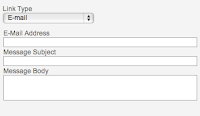
There are 3 Link Types URL, Link to anchor in the text and E-mail. Here are some of the

  • URL: Protocol http://. Where you enter the full address of the destination link eg. www.mailroom.co.nz.
  • URL: Protocol http://. Where you enter the full address of the destination link, when it a secure webpage eg. https://www.facebook.com/SpiralWeb
  • URL: Protocol ftp://. Where you are linking to an ftp site. Very rarely used.
  • URL: Protocol news://. Contact us if you need to use this.
  • URL: Protocol other. For all other links.
  • Link to anchor in the text. Where you link to a previously setup anchor on your page.
  • E-Mail. Where you can create an email pop-up

... and "Browse Server" which allows you to insert links to PDF files on the web server (you must upload them to make them available online)


Target Info
Target controls where the new document will be displayed when the user follows a link. Most of the time, clicking on a link simply loads a new document in the same window. With the Target attribute you can have the link open in a new window.Target has four predefined values:

* "_blank"
* "_parent"
* "_self"
* "_top"

Where you enter the name of the destination frame on a page with multiple frames.

Where you want a pop up window. 

New Window (_blank) when you want the link to open in a new browser window.
Topmost Window (_top) when you want the link to open in the topmost window of a set of frames and the page is to occupy the whole screen.
Same Window (_self) when you want the link to open in the existing window (this is also the default).
Parent Window (_parent) when you want the link to open in the parent frame of a set of frames.

Advanced Info
Take a look at this one - if you know what these terms mean then go ahead and use it otherwise you may want to read up on HTML before you attempt using this element.


Creating smart, meaningful links will help you get a higher Google listing and help people find your website.

Good luck with your links and remember you can call us in the office for a refresher on what to do.


Friday, March 16, 2012

What we've been up to so far this year ...

This is, of course, the quarter that often speeds by the fastest because it starts off with holidays in January. Apart from holidays the team have been busy on:
  • writing patient management software for a clinical trial running across NZ & Australia
  • developing and delivering software to speed up the stocktake process for businesses,  by using handheld barcode scanners
  • overhauling a clients website, adding new graphics and extra functionality
  • database work for both the NZ Registered Architects and the Rail Heritage Trust of NZ 
  • styling RSS feeds
  • learning more about the Facebook developers platform for an upcoming application we are writing
and Cain went to Webstock, an inspirational conference for web professionals - designers, developers, usability experts, content writers etc ... he's back at work, refreshed, inspired and ready to implement all the cool stuff he learned.

Monday, January 16, 2012

New Zealand Browser Stats 2011

Looks like Internet Explorer is not as popular as it once was in New Zealand, according to Statcounter Global Statistics. While holding its number 1 spot it has dropped below 40% of browser usage.  Google's Chrome browser has overtaken Firefox to becomes NZ's number 2 browser.


What does this mean for you?
If you are not already using Chrome it means, after you have done website updates, you need to look at your website in

  • Chrome
  • Internet Explorer
  • Firefox
because sometimes they will display your updates differently/unexpectedly.

Stats for mobile devices show the iPhone browser useage far exceeds any of the other mobile browsers.

Wednesday, November 30, 2011

Is your password on the hackers top 25 list?

The end of year lists have started! Splashdata have published the 25 worst passwords for 2011.  The list was compiled based on millions of stolen passwords posted online by hackers. Here it  is:

1. password
2. 123456
3. 12345678
4. qwerty
5. abc123
6. monkey
7. 1234567
8. letmein
9. trustno1
10. dragon
11. baseball
12. 111111
13. iloveyou
14. master
15. sunshine
16. ashley
17. bailey
18. passw0rd
19. shadow
20. 123123
21. 654321
22. superman
23. qazwsx
24. michael
25. football

Did you see yours? If your password is on the list you might want to change it.

Monday, November 28, 2011

Upgrade time

Back at work after a week in the south island so it was time to upgrade to iOS5 on my iPad. The little iPad was my "work" machine while I was away. Rather then a laptop I chose to take the smaller iPad with it's bluetooth keyboard - worked a treat. As I was relying on it there was no way I was going to upgrade to the new OS just before going away.
All up it took about 2 hours to do the downloads, perform the upgrade and connect to iCloud - sweet!

Wednesday, November 16, 2011

Where to post your status!


Confused by social media and not sure where to post your status. KISA sent me this handy flowchart to help you decide.


Tuesday, November 15, 2011

My old t-shirts remind me of websites

Its time to get out last summers t-shirts. The weather is warmer and more dependable.  I can categorise my old t-shirts as follows

  • quality t-shirts I want to keep
  • quality t-shirts that are already out of fashion
  • stretched saggy ones - poor quality
I'm always grateful when my quality t-shirts last a couple of summers. My biggest disappointment is when I love a t-shirt and it goes all saggy and baggy with just a few washes. Its not just the waste of money, its the waste of time - all that shopping time wasted!

Those t-shirts remind me of websites in that ...

  • when you commision a website that goes out of fashion next year, you are in for an upgrade earlier than you expected ... a waste of time and money.
  • your old, cheap website can quickly start to look like that saggy, baggy t-shirt which is not a good look for your organisation
  • your quality website will look good next year and the year after, it will be easy to update and you will wear it with pride
We strive to build quality websites and software for people. Looking back at last seasons websites I believe we achieved that goal, thanks to our customers for being open minded and make some tough decisions.


Monday, November 14, 2011

How people use websites and cloud software

This week we will be delivering a beta, or test version of the software we have developed to record patients (anonymously) who have agreed to participate in a double-blind medical trial.  We have already spent a considerable amount of time observing people using the website and using the results to improve the software.

One of the most significant lessons in all this "watching" is that people show us through their actions or behaviour, how they will use the website and often this differs to what they tell us they will do or want.

The research co-ordinators at Wellington ICU, who start using the software this week,  will be entering real data and giving feedback on the software. This is the 3rd stage of a simple process we use to find out how people actually use a website or piece of software. The 3 stages are:

Stage 1

During the first stage I gave a set of tasks to perform, on the website, to 3 people. Tasks like

  • log in to the website as a Research co-ordinator and invite other users within your site
  • randomise a patient and allocate a treatment pack to them
  • add 2 patients to the screening log
While my test subjects were performing the tasks I wrote notes on how they interacted with the website. We also videoed the session so we could go back and view the interaction. 

Stage 2

This stage was similar to stage 1 but this time we used people who would be using the software and had a background using medical trial software. Where stage 1 gave us information on how a person might interact with the software, stage 2 gave us information about how an informed user might interact with the software. An example of the difference is the people in stage 1 used the mouse to navigate the website and the forms, whereas the people in stage 2 used the mouse for navigation but used tabs for the forms.

Stage 3

In the 3rd stage the actual users of the software get a chance to "play" with it. The results of this stage are useful in familiarising the users with the software before they begin using it "for real" and they get to give us feedback. We use that feedback to correct any errors that may have slipped through our testing process and make subtle improvements to the website.

We use this information to make the website easier to use, make the software more efficient and to tell us if things are working the way the customer (or end user) is expecting them to work.

Aggregating Content

Our blog is undergoing a redesign ... not just the look but also the structure. In my mind structure/function and look must always go together, as to which comes first ... thats the topic of another post, not yet written.
It's getting:

  • a new name
  • new purpose
  • more people writing to it
Hope you like it and please, tell us how we are doing.